Comcast/Xfinity
Today, viewers can search and browse a catalog of approximately 500,000 assets using filters and recommendations. This case study looks back at an early Comcast set-top-box search-and-browse project. At the time, viewers had limited ways to navigate the catalog. My team developed a proof of concept for a more flexible experience.
The Challenge
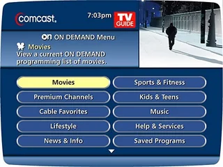
The original set-top box interface offered a limited set of categories, limiting access to the hundreds of thousands of shows. Viewers needed a way to dig into that material with more categories that reflected the way they described choosing television. The goal of the project was to develop a proof of concept that was easy to navigate through 500,000 assets. The stretch goal was to never come to a dead-end, always providing a way to make a new selection.
My Role
As UX Lead, I led a four-person cross-functional team (a developer, two researchers, and one data scientist) to develop a low fidelity prototype in six weeks. I was responsible for user research, information architecture and UI design. I built the first proof of concept for Xfinity’s search and browse functionality, focusing on taxonomy and drafting a choice-based UI that offered almost endless selections through guided facets. I based my choices on user research, doing both discovery around TV watching and selection, as well as confirming my decisions.
Research
I interviewed 15 participants, one at a time, to understand how they chose programs. Participants used both broad categories, such as genre, as well as context-specific facets, like show language.
Design Response
I wanted to understand users’ mental models for choosing what to watch. Our goal was to allow our users to be able to select one item out of half a million that would satisfy their watching goals. We hypothesized a well-designed filter system could help. Facets aren’t enough — we also had to build relationships between them so that visitors could do a more complex search.
For example:
- “I want to watch a comedy with Tom Cruise in it.” Simple. We can easily do this with the provided data about television shows.
- “I want a movie like “Magnolia” that has Tom Cruise in it.” This allows a comparison between all the aspects of “Magnolia” with the rest of the catalog, with one special request — Tom Cruise. It also meant that the taxonomy facets had to be able to mix and match, allowing visitors to have more sophisticated selections.
Research Approach
We had a small living-room-style usability lab with a couch and a coffee table. We interviewed fifteen participants (one at a time) to learn about how they selected shows. We found out that users define content in universal terms (like “genre”) and some highly specific descriptions.
We set out to make a mental model of how people choose television shows. My hypothesis was that people knew genres, actors and directors or specific shows that might influence their choices. Instead, we found an idea that people had an amorphous idea of “a good show.”
Discovery Findings
We conducted fifteen interviews to listen and learn about television selections. While we had a test script, we also left plenty of time for open discussion. Test subjects often used the television to show how they searched for programs, or used the programming guide. A few participants showed how they watched television on their phones, novel at the time of the project.
Conversations ranged from purely tactical to deep insights on choosing. Four participants talked extensively about content standards and parental choice, which lead to a set of parental controls. None of the participants used the programming guide search function, which informed the prototype design and interactions. Search and content control were the key features of our new prototype. Other findings included:
- Many participants just wanted a show that was “good.” Indicators of quality included networks, actors, directors, and specific franchises.
- The mental model of “good” was multidimensional. There was rarely just one aspect of “good.” Examples of “good” were “a sit-com on BET,” “Batman movies from the 90s” or “dramas with women characters.” We did get some clear insight on what those facets should be.
- People learned about television shows from advertising and word of mouth. If a friend recommended it, there was a higher chance of it being “good.”
- Parents with small children were most likely to buy PPV than any other group. This was a key piece around content displays, and putting PPV more prominently in children’s programming.
Persona
I constructed a persona, the Wolfe Family (View the entire file). It was important to bridge the marketing segments we started with and actual tasks to make sure that we met users’ needs.
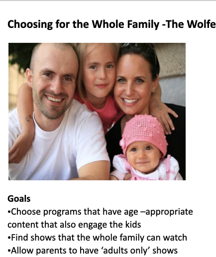
We gave all our personas notes on:
- Choosing Behaviors (scale of fixed - flexible),
- Finding Behaviors (browse to search), and
- Watching Behaviors (passive to active).
Additionally, the Wolfe family had some key concerns about quality, as well as audience appropriateness. Adding children to the mix added challenges — signifying “good” content was important to entice parents to buy PPV.
IA: Universal Facets
Now that I had a mental model and a framework, it was time to use the data model to match the users’ vocabulary.
I had one set of Universal Facets — metadata that was always present, and that I could easily get from rovi (a dataset that contains information about a television program). I picked the following from the rovi set:
- Content ratings (age from V-chip age ratings, proposed content flags like “smoking”, “sex”, “bad language”)
- Standard metadata (title, description, broadcast info)
- People (actor, director)
- Genre (Action, comedy, drama)
- Awards (Academy Awards)
The second set of facets were meant to be used together for contextual weighting. Some parts of the taxonomy triggered unique facets. For example, language became a primary facet for foreign films, while “type of game” (regular vs. playoff) was prioritized for sports. These facets were used to weight search returns, ensuring the most relevant content surfaced once.
Design Rationale
Our overall visual experience was a very low fidelity prototype built on a command line. To test it, we had users guide us through the experience of what to choose and when. Like the data model, we had a set of universal settings, labelled “standard preferences”. Standard preferences handled the mental model of “things I want to see/don’t want to see.” We also added an “on now”/“on in 15 minutes” filter to help users know what to watch next on broadcast shows.
Guided Exploration: Seeds
I used the contextual weighting facets as search “seeds”, facets that allowed users to dig deeper into some aspect of the content. This low-fidelity wireframe with notes shows the progress that one user might have, along with outstanding questions that I had for the next iteration of the product.
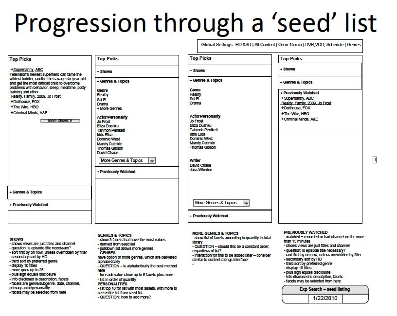
Seeds allowed us to address the mental model of choosing. Not all facets are equal. We found that genres, actors, and shows had the most importance, and were given extra weight in consideration. We also addressed a controlled vocabulary, so we could address how users described shows:
- “I want to see a funny show.” (Comedies)
- “I like Will Ferrell.” (Comedic actor)
- “Ice Age” is hysterical (Animated comedy)
We initially provided seeds of Genre and Actor/Personality, as well as a list of previously watched programs. The user would choose one, such as “Idris Elba”, and would receive a list of programs that featured Idris Elba, as well as related material. Related material could include television writers (David Chase), related sub-genres (in this case, police shows) and other actors in the show. Users can journey through each of these, or just pick a single show. Seeds allow endless browsing and endless choices. The majority of users felt energized and positive about the ability to explore.
Your Picks
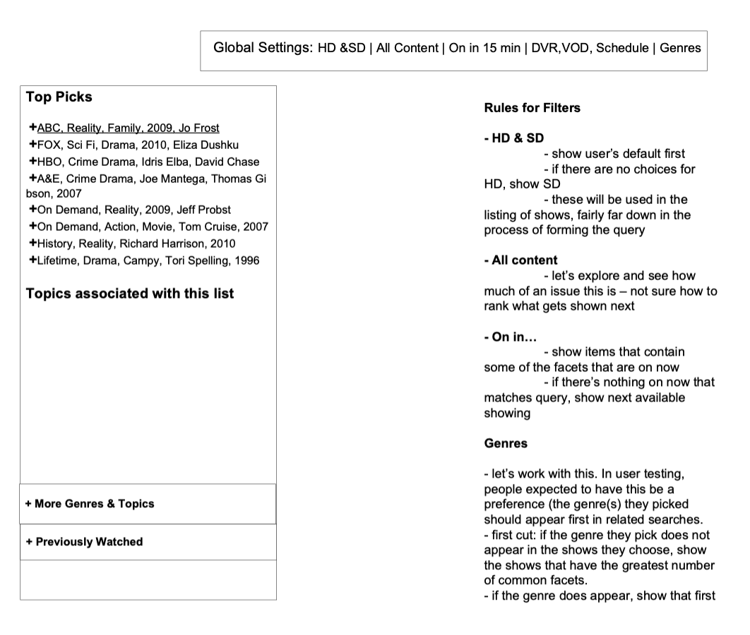
I designed a one page Picks summary that made system generated suggestions based on your previous watching behavior (Top Picks) and Your Picks that showed you suggestions very specifically based on your choices.
Your Picks attempted to capture the idea of quality, providing only “good” choices for the users. Your Picks required that the user make enough choices to display more than one actor or one show. Your Picks also had a preferences screen, to encourage further specialization.
Outcome
This six week effort produced a low-fidelity proof of concept of a faceted search with weighted outputs. The “Your Picks” concept was not completed within the project timeline. This work took place approximately ten years ago; the prototype explored taxonomy, metadata, and guided search using the tools available at the time.