Freddie Mac: Guide
Content strategy for the Seller/Servicer Guide
Freddie Mac, Content Designer | Completed 2024-2026
What’s in this document
- Outputs from the project
- Results
- Discovery/Research
- Stakeholder Management
- New Guide Styles
Outputs
Make the Seller/Servicer Guide (“the Guide”) more “user friendly” and “easy to use.” When I was done, I completed the following:
- Produced the first-ever style guide for the Guide that was used over the entire Single Family Division (a third of the company)
- Upgraded search interface and results
- Structured content that enabled an AI driven Guide (in progress)
- Intense stakeholder management between seven departments
- Designed metrics that let us measure what user friendly was
- Training for a five person team, as well as socialization across the enterprise
- Research (journey map, personas, service blueprint) showing customer experience within the Single Family Division
Result
- Increase in customer satisfaction (evaluation forms, customer round tables)
- Decrease in call center call time (in other words, they didn’t need to work as hard to serve customers)
- Time on site and page decreased (customers found what they wanted easily and left quickly to do their work)
The Business Problem/Discovery
The Seller/Servicer Guide (“the Guide”) was a major piece of friction between Freddie Mac and its customers. Written as a massive legal contract, it was cumbersome, difficult to search and hard to scan. Internal stakeholders and legal writers felt that the Guide was fine as it was - it was a legal document, and customers had to put up with the quirks. However, another faction at Freddie Mac wanted the Guide to be tactical and task based.
Through research, we determined that people who visited the Guide wanted to get in, find an answer, and get out.
A quick peek at analytics showed that our customer base for the Guide were smaller banks and credit unions. Larger, national banks had lawyers and staff to interpret the Guide for their teams. I realized that we needed to make the Guide task-based to help the majority of our user base.
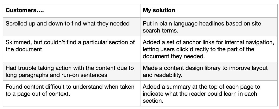
Microsoft Clarity, Call Center recordings, and user interviews showed us how the Guide was failing, pointing to several solutions.
Problems/Solutions
Stakeholder Management
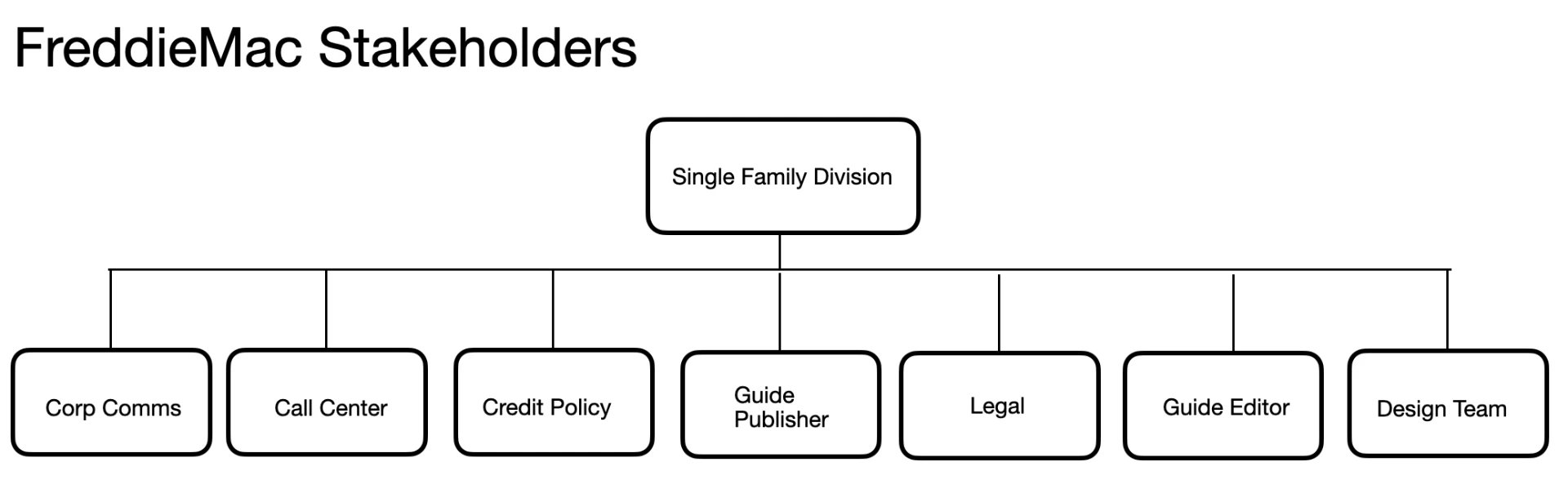
I worked with these departments in the Single Family Division to get them to come together and approve a new process that placed emphasis on the customer, not the legal process. Getting them to work together required many, many presentations with an emphasis on how their department would both benefit from the changes, as well not lose any decision-making power or authority. I had to learn about each department in detail, and understand what their role was in the publishing process. Stakeholder management was easily the largest chunk of time in this project.
Customer-Centric Publishing Process
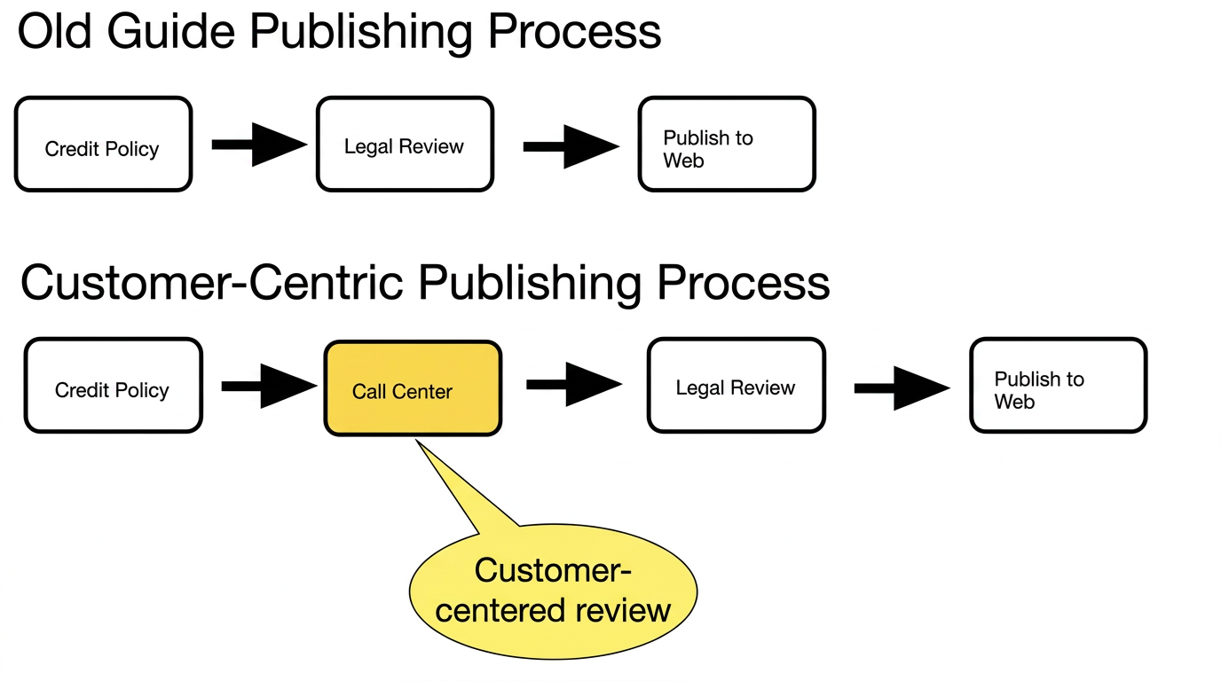
We also added a new, customer-centric review to the content. This step applied the content strategy and design before pages went through legal review, becoming cast in stone.
Finally, we had the Call Center follow the style guide to implement the content patterns. They were the perfect choice to ease in the change as recognized subject matter experts on the Guide. I designed a design pattern library and review process for the Call Center that did not add any appreciable burden to the review process, but drastically increased the efficiency for the Call Center.
The customers loved it.
New Guide Styles
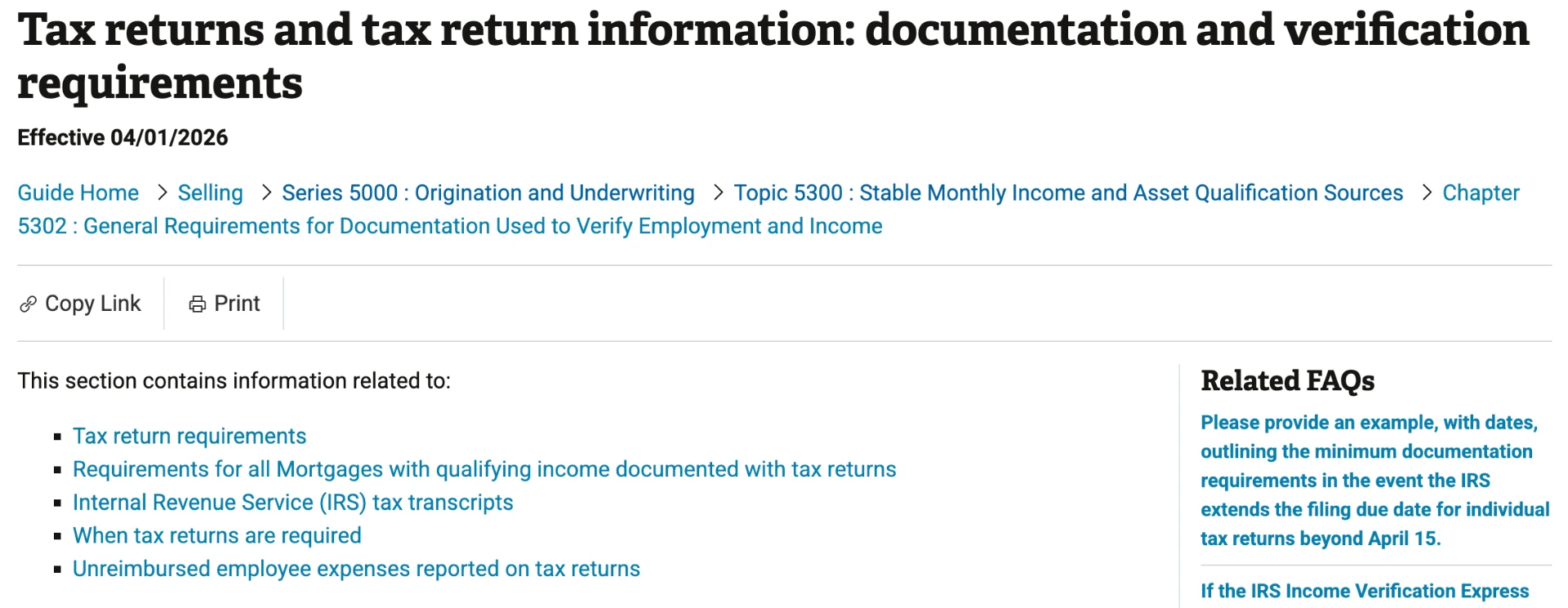
See it on the web at https://guide.freddiemac.com/app/guide/section/5302.2
The page summary and internal navigation
I added the summary/navigation layer to the page to address scrolling. Once visitors could jump directly to a section, we saw drastically less scrolling and lowered time on page.
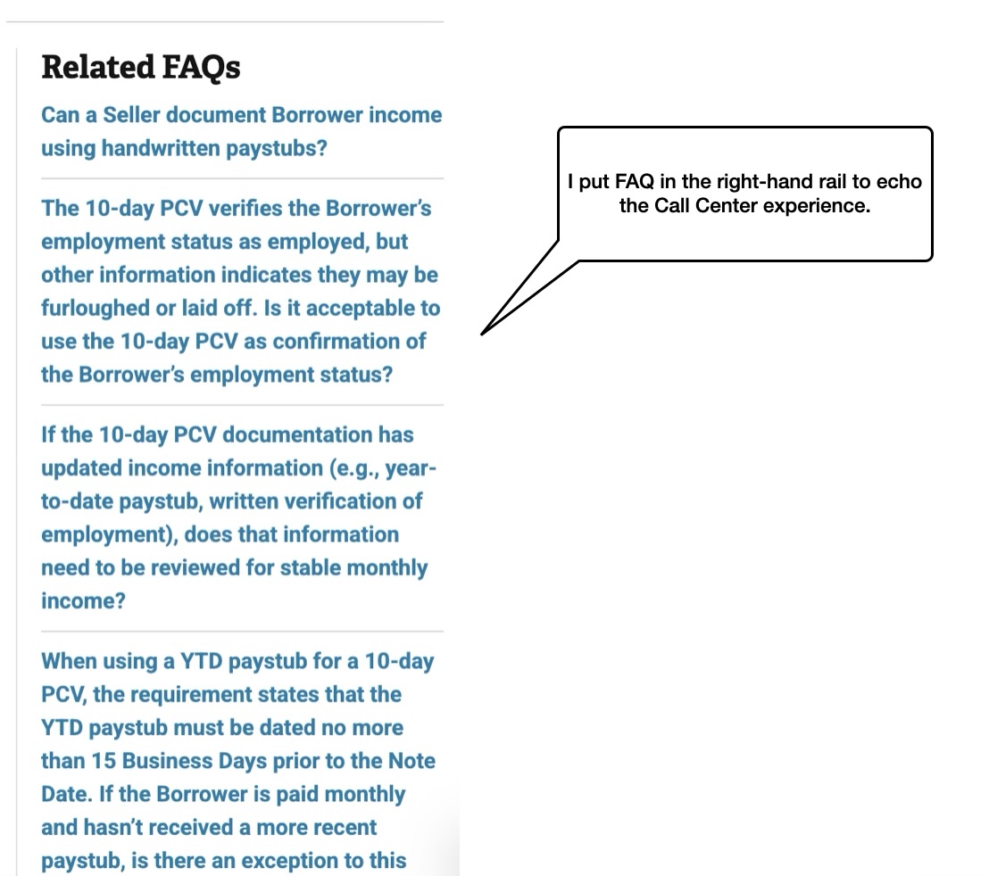
Related content
I wanted to echo the Call Center experience, so I added FAQ (derived from the Call Center knowledge base) to the side. I also added direct links to required forms and fact sheets. Related Guide Sections remained in-line with the text.
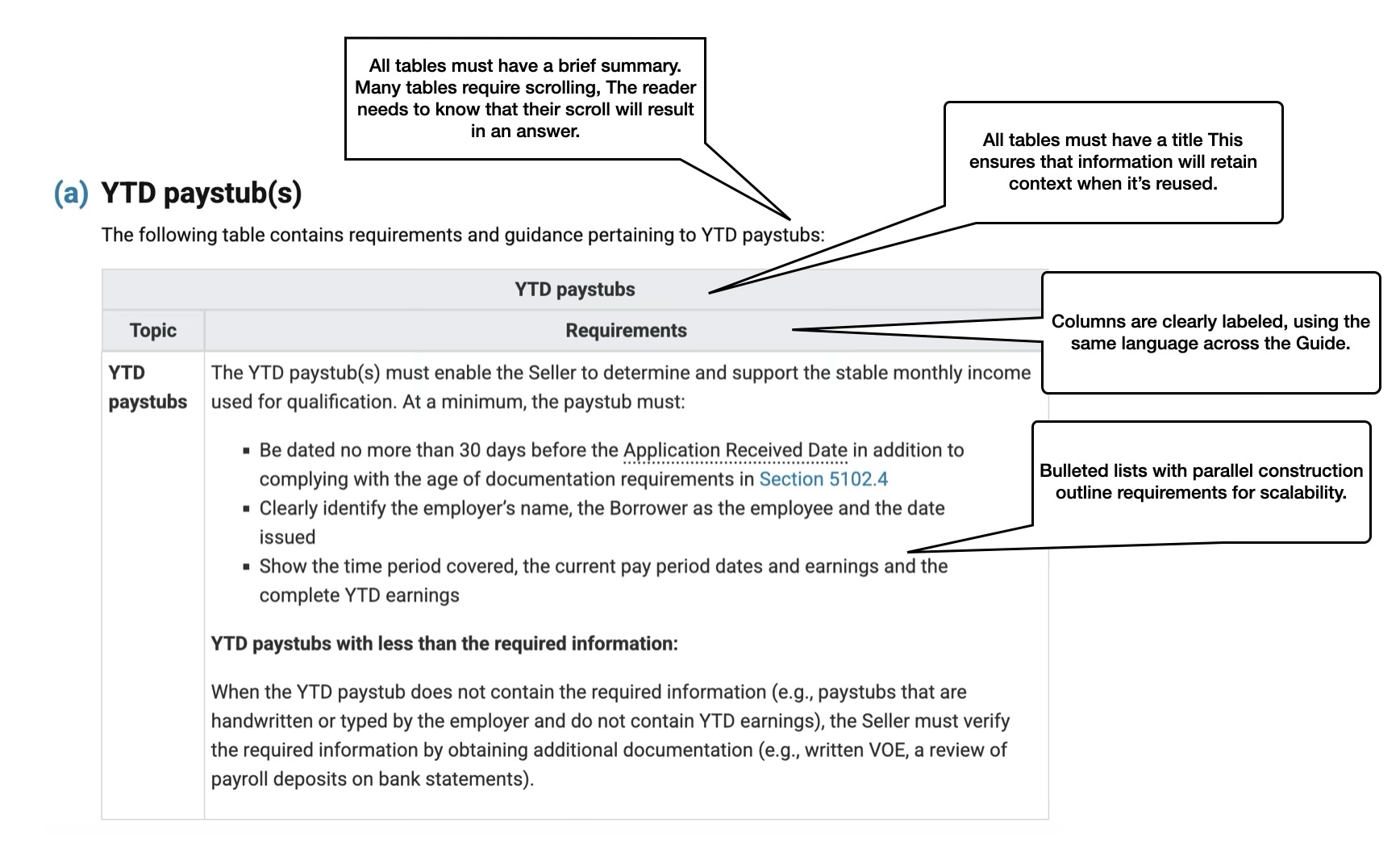
The table
Before the changes, the document had long paragraphs with run-on sentences. I created a summary table that organized requirements by topic, making them easier to scan and act on.